New Feature Release: A new powerful editing experience

We are very excited to be releasing a completely new editing experience for all our users. Whether you are an administrator, moderator, or contributor, you will love how fast and enjoyable the experience of creating and editing guides has become.
Table of Contents
What is it?
The most visible change is the editor and content overview now being displayed more intuitively along the left-hand side of the screen from where it can be moved to the right-hand side. This vertical alignment allows faster and more intuitive guide building and editing experience. Now you can preview specific changes directly from a step within an individual guide more quickly before saving them. Displaying the content overview vertically also means that you now scroll down when working on a guide with many steps.
But there’s more.
We’ve added seemingly small changes for a better user experience when it comes to organizing, searching for, and managing your guides.
How does it work?
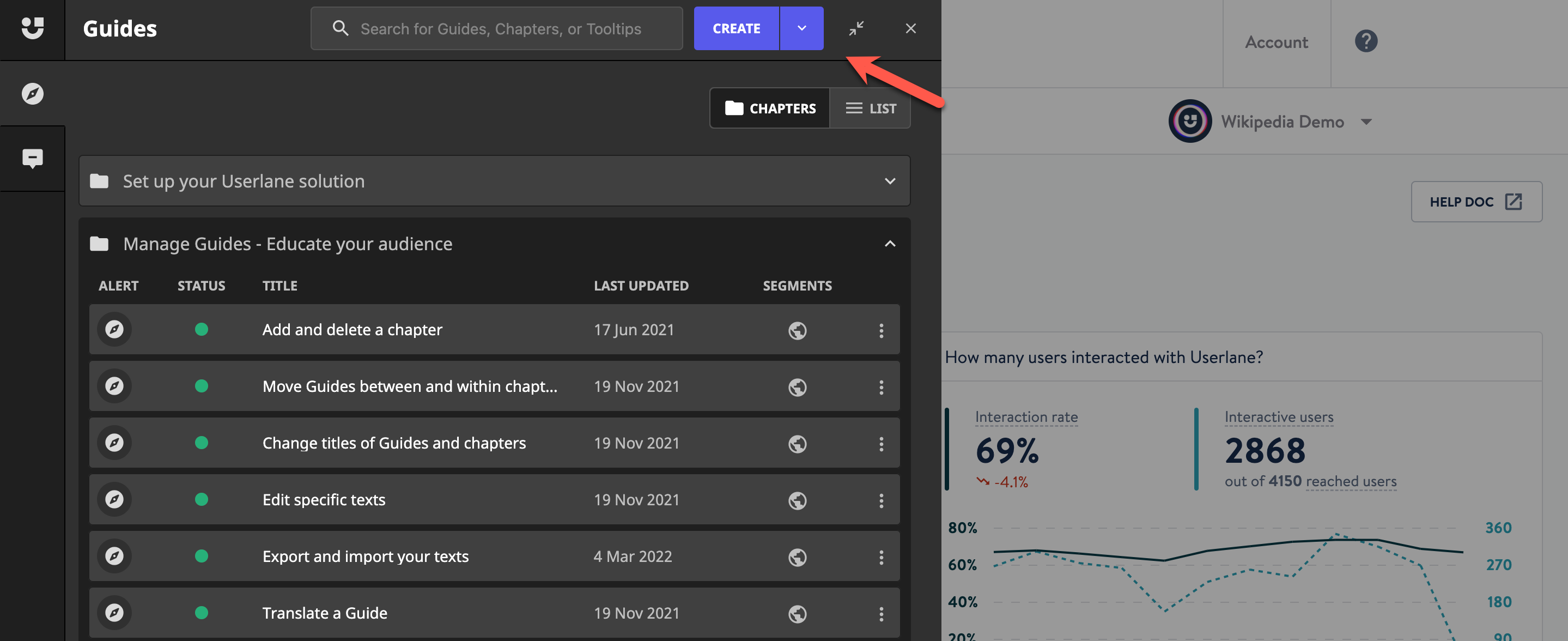
Users can now find all existing guides in an improved overview design with an added search function. The new overview design will display your guides within the familiar chapter structure and now comes with a hamburger menu from where you can delete and duplicate a guide or jump straight to the guide analytics within the Userlane Portal. Then there is a new list view that will display all your guides regardless of chapter structure, in a list that can be sorted by status, the date it was last updated, or the title. The status of individual guides is now displayed in these overviews alerting the user when there is an issue with a guide.
To make things even simpler, we have added a language switch within the editor, making it easy to change your content from one language to another. We also re-designed the “add step” control to allow for easier scanning of the content.
Last but not least, the code selector has received technical enhancements, including an automated code check which will ensure your custom code is correct and will display as expected, plus the ability to reselect elements.

What problem does it solve?
In addition to introducing a completely new content creation engine that allows faster and more intuitive editing experience, we took the opportunity to add a bunch of smaller changes to make your life easier.
Displaying the status of a guide within the overview alerts the user when the interface of the underlying application changes and certain steps of the guide need updating. Displaying this color-coded health indicator already in the overview helps you locate and update affected steps much quicker, especially when you have lengthy guides to maintain.
How will we be building upon this?
With the editor being a key part of content creation, we are continuously evaluating new ideas on how to ensure creating and managing engaging content with Userlane is a great experience so watch this space.

