How to Optimize Onboarding Conversions with UX Writing

Convincing someone to sign up for a free trial is only half the battle.
To actually acquire new users and build a sustainable product, you have to get people engaged and activated.
But people leave apps nowadays faster than awkward first dates. To win their loyalty, you need an airtight onboarding process. Without one, you risk a sizable portion of your users churning after only using your app once.
Onboarding is complicated, and there is a multitude of ways to optimize your conversion rate. But one of the most important, and often overlooked, is UX writing.
From big budget ads to billboards, excellent copy has always had the power to influence people. The same is true for your product onboarding, although writing UX copy is more about guidance and less about selling.
When your UX copy is good, it can dramatically improve usability, which gets more people to stick around, finish the onboarding process, and take a big step toward becoming loyal users.
Table of Contents
A Brief Introduction to UX Writing
UX writing has only recently caught fire, so it’s still an emerging discipline. Before we dive into the “how-to” stuff, let’s define UX writing and examine how it’s different from traditional copywriting.
In digital marketing, copywriting is the practice of crafting messages that either influence how people perceive your brand or convince them to take action in a particular moment.
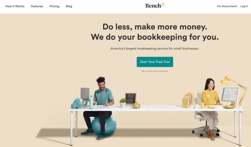
Copywriting is a function of marketing, and its audience is typically potential customers (although there are campaigns that target existing customers). The headline, content, and subhead on Bench’s homepage are classic examples:

UX writing is the practice of using microcopy to improve the usability of your product or website and helps users accomplish their goal with as little friction as possible.
The difference is subtle, but important. UX writing helps users achieve value with your product while copywriting tries to sell them on that value.
This style of writing has emerged because product design has matured, and we now know more about what people need help with than ever before.
The search bar is a prominent example. When people see a blank bar, they struggle with what to search for. They need some guidance. Look at how Airbnb provides an example of how people can use their search function:

What once made people think, “What should I type here?” is now straightforward because of the microcopy. This technique is so effective that providing examples in search bars is now par for the course.
Here’s how Canva helps users decide what type of design assets to search for:

The blank search bar is not an anomaly. Users will have little moments of hesitation throughout any onboarding process. Skillfully written microcopy can assuage people’s fears or provide them that little bit of information they need to continue to the next step.
These changes may seem small, but they can make a huge difference in user engagement. When Google changed “book a room” to “check availability”, they increased conversions by 17% on their hotel search product.
Where UX Writing Matters Most in Onboarding
Now that you’re more familiar with UX writing, it’s time to look at how you can apply it to your onboarding process. Any UX expert will tell you that certain moments in the user experience matter more than others.
Here are three scenarios where great microcopy will make a big difference to your user experience writing strategy:
1. Explanatory Pop-Ups
These days people use technology in a constant state of urgency, which is why they form judgements based on the first impressions they have with products and websites.
Given this collective state of mind, it’s no wonder there’s such a low tolerance for friction in the onboarding process. If something is confusing or arduous, people will leave without an ounce of regret.
Of course, when people are learning to use new software, there are bound to be moments where they feel confusion. The solution is to have helpful information on hand that answers your audience’s questions.
You can execute this tactic in two ways: a pop-up that appears when someone hovers over an element or a guided product tour where pop-ups appear in a sequence and explain what’s happening. Both need top-notch UX writing.
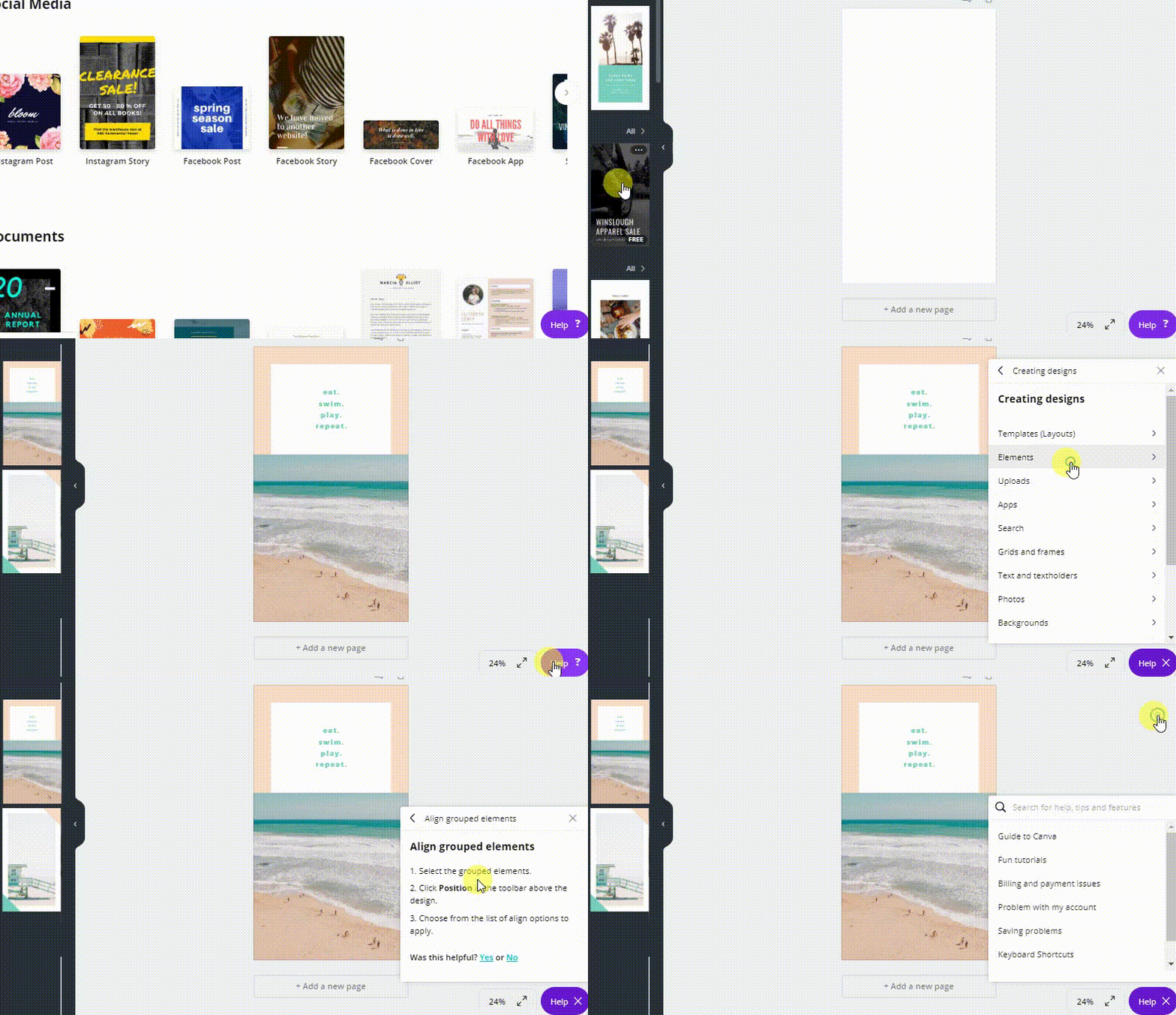
Canva’s entire goal for their product is to create a design tool that’s easy for the masses to use. So they opt for the latter approach and provide a guided tour.
The microcopy is short and to the point. With only a couple of clicks, I’ve moved from a blank box to an editable template.
My first design quickly goes from this to this:

By showing users exactly how to create a design, Canva doesn’t leave any room for confusion. The microcopy in the tutorial provides a direct route to value for the users, which ensures newbies are engaging with the software instead of wondering what to do next.
2. Error States
Humans never use technology precisely as designers envision. When things go wrong in the onboarding process, it’s the UX writer’s job to provide instructions on how to correct things.
Errors almost always occur when there’s a form to fill out, so it’s a standard practice to have microcopy underneath the offending field along with a general message about an error happening.
Microcopy is most effective when it’s clear and to the point, but tone is particularly important here. No one likes to be told they did something wrong, so this is an opportunity to keep things light.
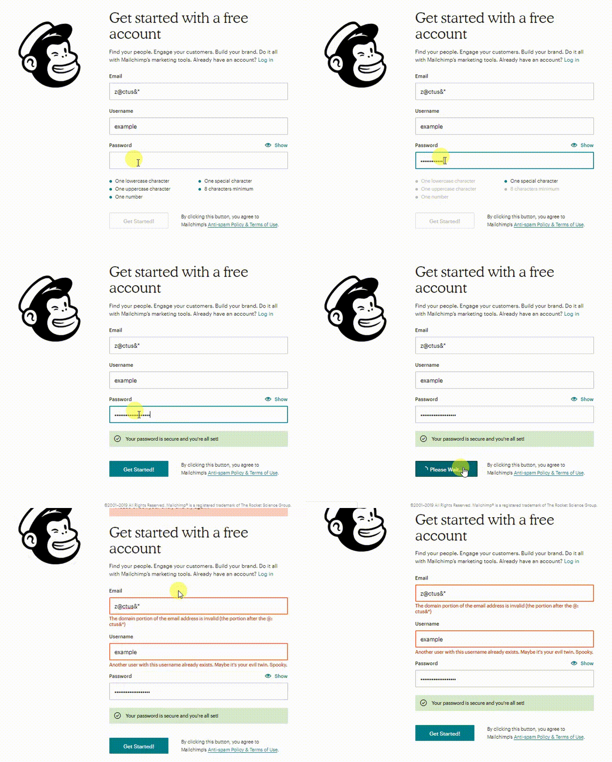
Here’s what happens when you mess up creating your Mailchimp profile:

I have a message nicely asking us to check and see what’s wrong. The microcopy under the form field explains exactly what we need to do. And just for a bit of encouragement, the green message under the password section lets us know that at least I did something right.
3. Calls to Action and Confirmations
CTAs are the product manager’s moments of truth. All of our hard work has led to this point.
So how do you make sure users push the button? Let people know exactly what’s going to happen next.
In conversion copywriting, it might be necessary to use a call to value, where the copy emphasizes the benefit the user will receive by converting.
But in UX writing, the audience has a different perspective. You still need to be persuasive in your CTAs, but the best way to do that is to make someone feel a sense of autonomy by giving them a precise sense of what will happen when they click.
This example from Headspace is one of my favorites:

The microcopy under The Basics section explains exactly what I’m signing up for. In the same vein, the copy on the button is crystal clear about what’s about to go down.
There’s simply not any room for ambiguity, and that gives me a sense of control over the experience, which makes me trust that pushing the button will indeed begin a meditation session.
UX writing is only part of the onboarding experience, but it has a central role to play. Without the right words in place, the most elegant designs will only lead to dead-ends instead of higher conversions.
By anticipating what users need as they explore your product, you can build guideposts that make the journey less confusing, more intuitive, and ultimately, more successful.
Interested in taking your user experience to the next level? Then listen to Userlane’s webinar with SaaS expert, Despina Exadaktylou, and find out how you can create a winning UX strategy for the product-led era.

